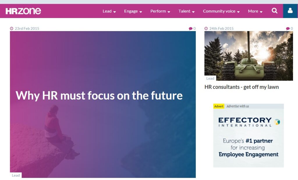
After a long wait, here’s our overview of the new design and what we like best about the new site.
It’s finally here, we can show off the new look HRZone and tell you the bits we like best. We’re really pleased with the new site layout and navigation and hope you will find the general site experience better than ever.
We want to hear what you think too, so leave us a comment below, or tell us on Twitter or LinkedIn.
Jamie, Editor
Everyone’s really busy and our site is designed to make it easier to get the content you want to view and solve the problems you have to solve. Things like infinite scroll and related content boxes have been included to showcase our new, improved content, and I really hope that HR professionals find HRZone more intuitive and insightful than ever before.
Shonette, Community Editor
Of course the part I’m most excited about on the new site is our improved community functionality, with simpler registration, good looking profile pages and a better user experience. I’m keen to see how the new site works for you, and hopefully also see more comments and blogs from our expert community than ever before!
The new HRZone: Fast Facts
A quick summary of things to look out for on the new site:
- New navigation – find content under the new header Talent, Perform, Engage & Lead
- Suggested reading boxes – we’ll tell you what content is also popular & relevant to you
- New member profile pages – your profile page will look better than ever
- No Any Answers, private messages or notifications – these will be returning later this year, once we’re happy that the rest of the site is as good as we can get it!
- For a full breakdown of the changes, FAQ and help guides, visit our helpdesk


